
Module 1 – Major Project and Creative Enterprise
Week 1
Table 1
Daniel Boyle
Scott Gill
Julie Kane
Nadine McLoughlin
Blaine Fox
Stage 1 – Brainstorming
Finding a concept at the beginning of this project was challenging. We as a group I find struggled briefly to find a direction in this module. However after brainstorming and reading books from the required reading list such as “A Handbook for Visionaries” by Osterwalder and Pigneur, we found inspiration and a path to follow. We branched out in our ideas and explored each one for every possibility of success in attempt to further our flow of imagination.
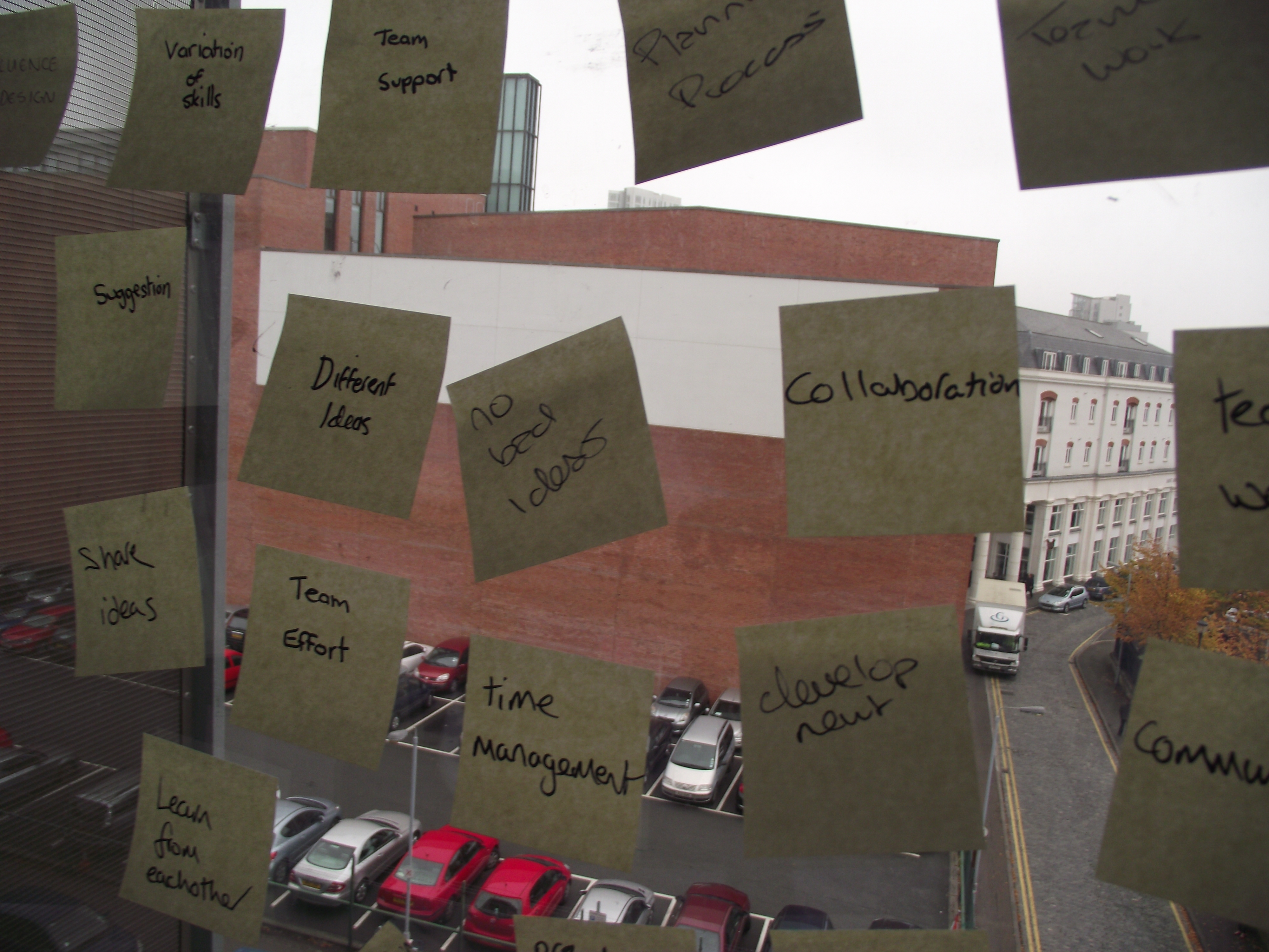 An example of our brainstorming of what is required when involved in a “Major Project” and how to achieve success in a “Creative Enterprise”.
We split the reading lists between eachother, each taking two books each and began taking notes and tips from each.
After a few days of reading books from the library we began forming ideas and feeding off eachother gathering as many concepts as possible. Once the ball was rolling we couldn’t stop. We used our sketchbooks and sketched the possible layouts of our ideas.
“UNCLE SAM PROPAGANDA SPOOF”
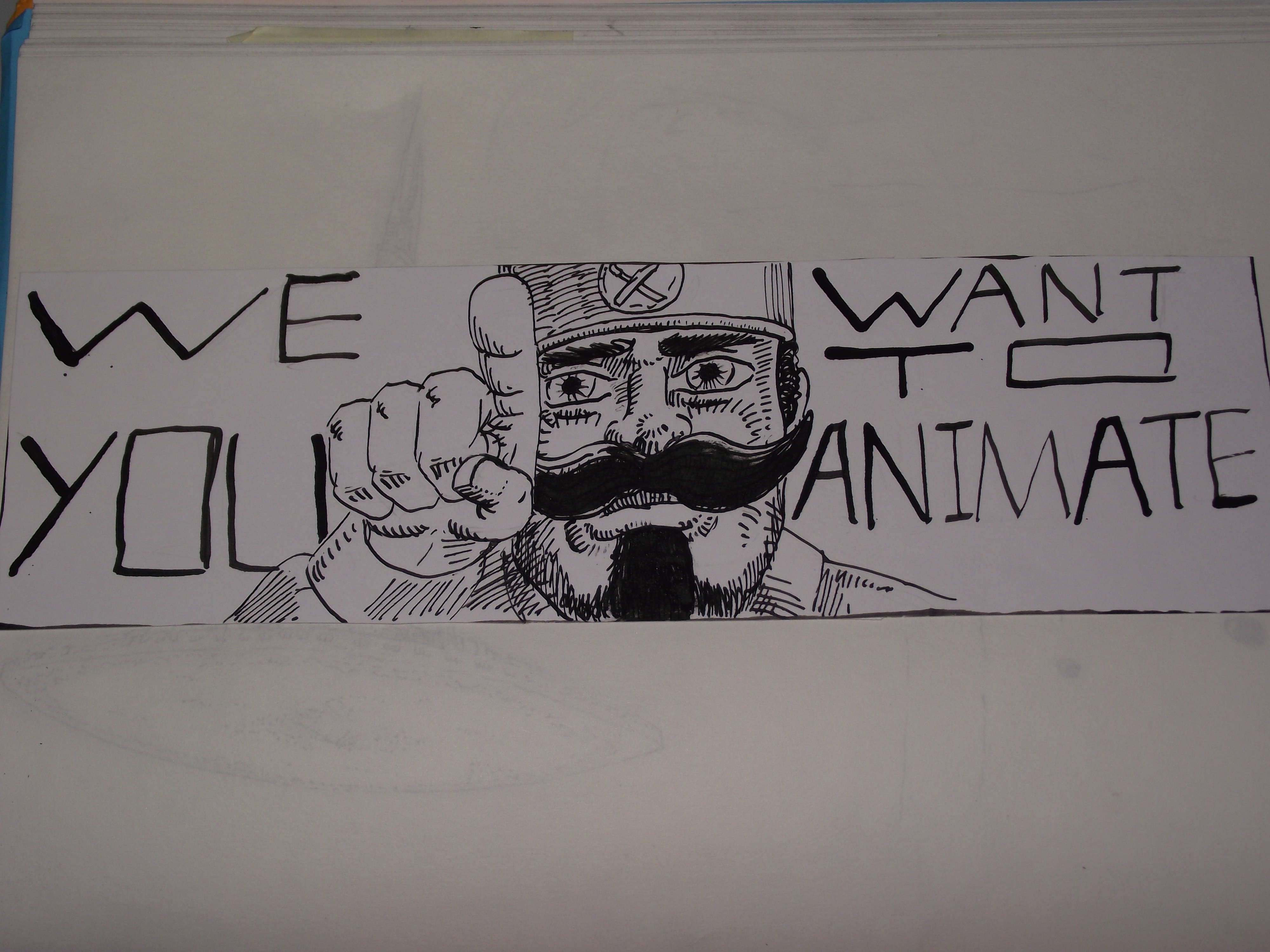 This is an example of an idea that we planned which was sketched and inked by Blain. This idea is a satire on the “Uncle Sam” American figure which was a propaganda image to enroll in the U.S Army. Here, we used that idea as a poster to enroll for animation. It was crazy, enjoyable and had a smart background story to the poster. Notice on his hat there is a symbol of a paintbrush and a pencil that cross over. That logo lived a brief life but the “Uncle Sam Propaganda Satire” was to be a continuing concept and was a favourite among the group.
“THE ANIMATION BAKERY”
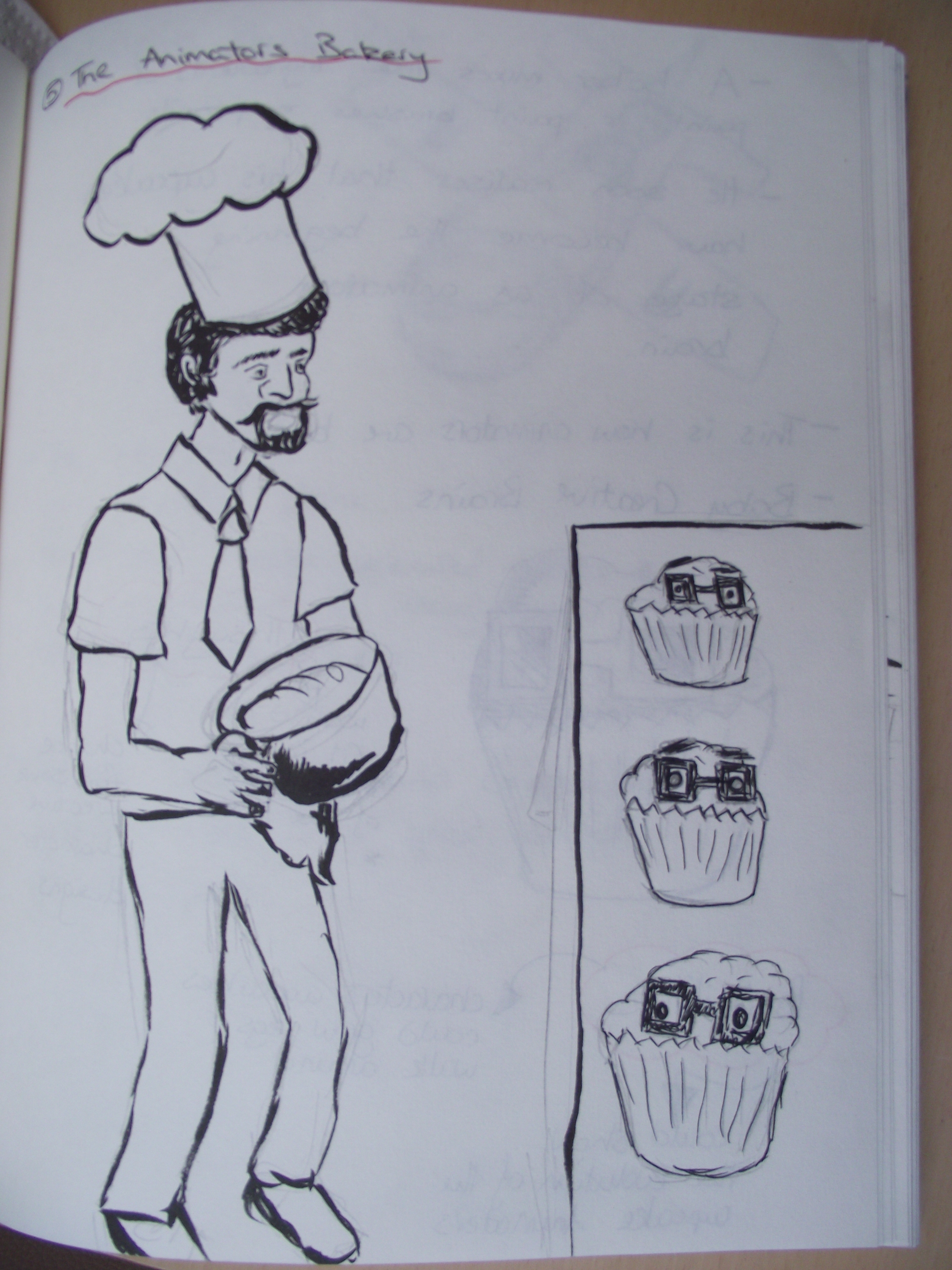 “The Animator’s Bakery”, was another concept of ours that was a favourite amongst the group. This is it in it’s original form. Just a quickly drawn sketch that I later revisited to make it more appealing by using a brush pen. This original drawing plan was to give myself an idea of the layout of the poster in the early stages.
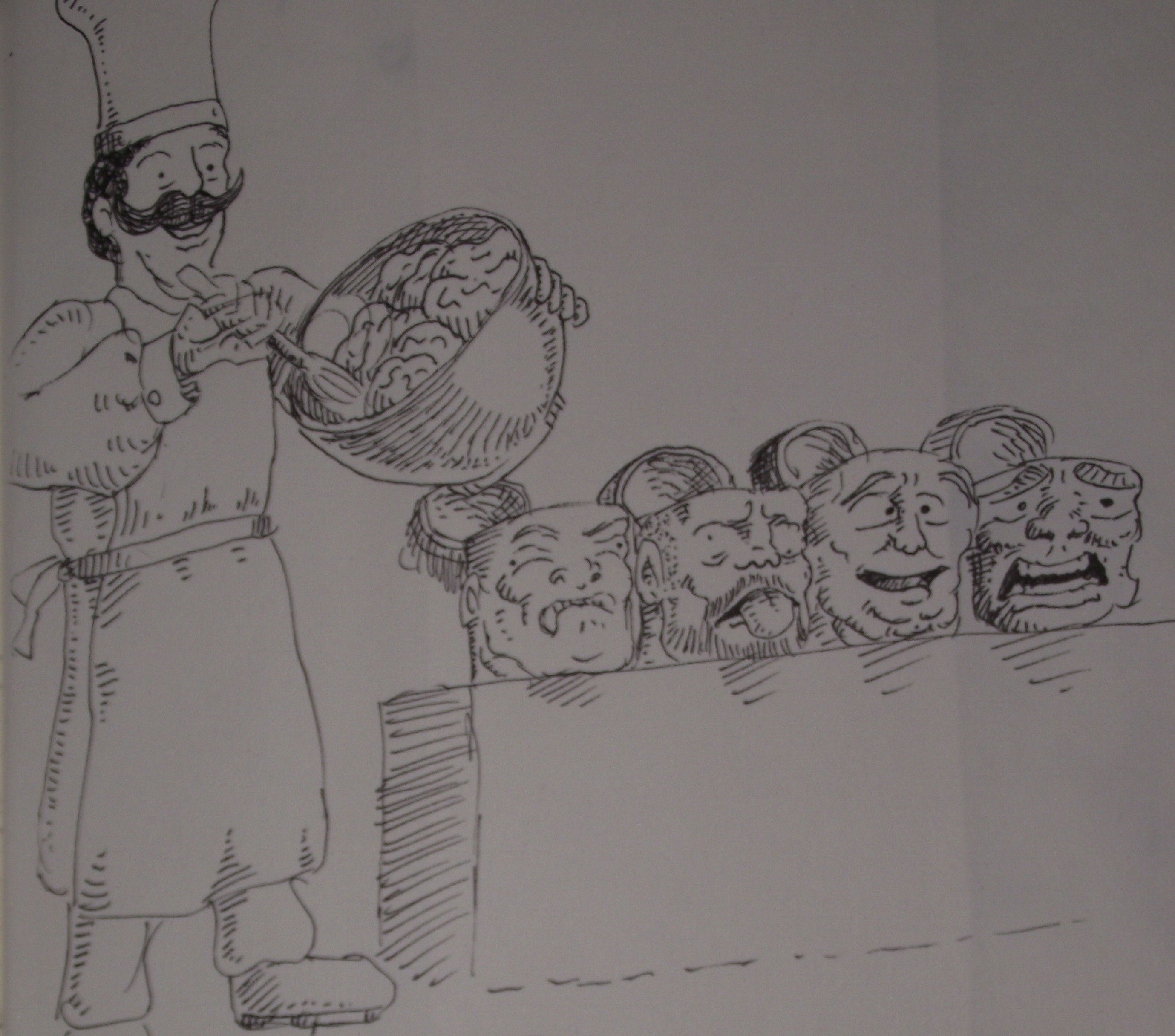 This drawing of the same concept (“The Animators Bakery”), was a final plan in preparation if the concept was to be used as one of our posters/graphics. The story of this idea is that baker makes buns but accidentally drops art supplies into the mix. This starts a reaction which then forms the early stages of an animators brain. This is where animators are born.
The Bakery concept was humourous, crazy and did not make any sense, but that was why we really took to the plan.
“Art Wars”
 The Art wars concept from the beginning, was a favourite. We saw so much potential in this idea that it had to be used as a poster. It fit the format of the graphic, there was potential for colour and also a possibility to incorporate some of our other plans into the background to give it a surreal feeling.
As the first Friday was drawing to a close, we went home to plan our ideas further and to try and think of more concepts over the weekend.
End of Week One.
Week 2
Stage 2 – Concept Development
On Monday morning we shared our plans that we thought of over the weekend for the two posters/graphics and quickly sketched out our ideas to gather a picture in our minds of how our ideas would look as a poster/graphic.
These were some of our new concepts;
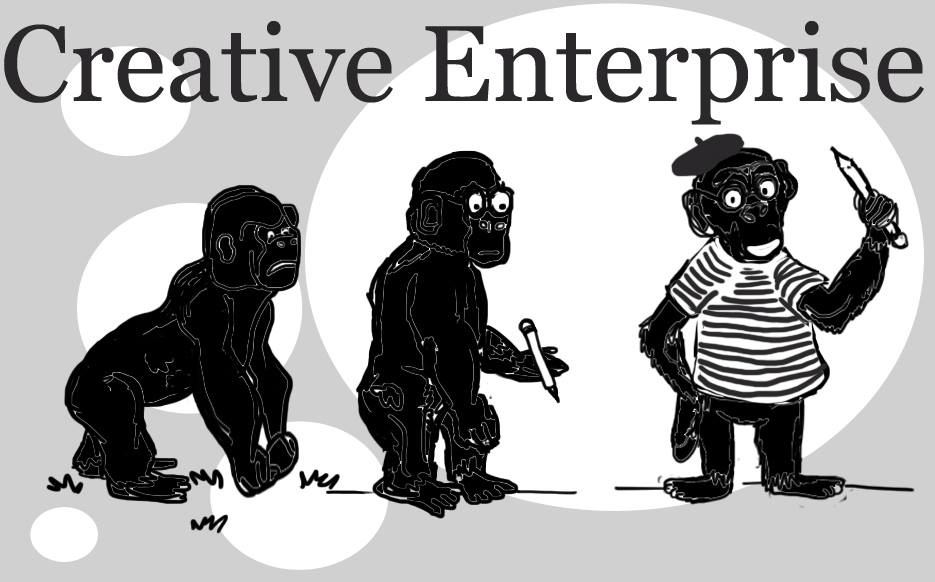
“Evolution Of The Animator”
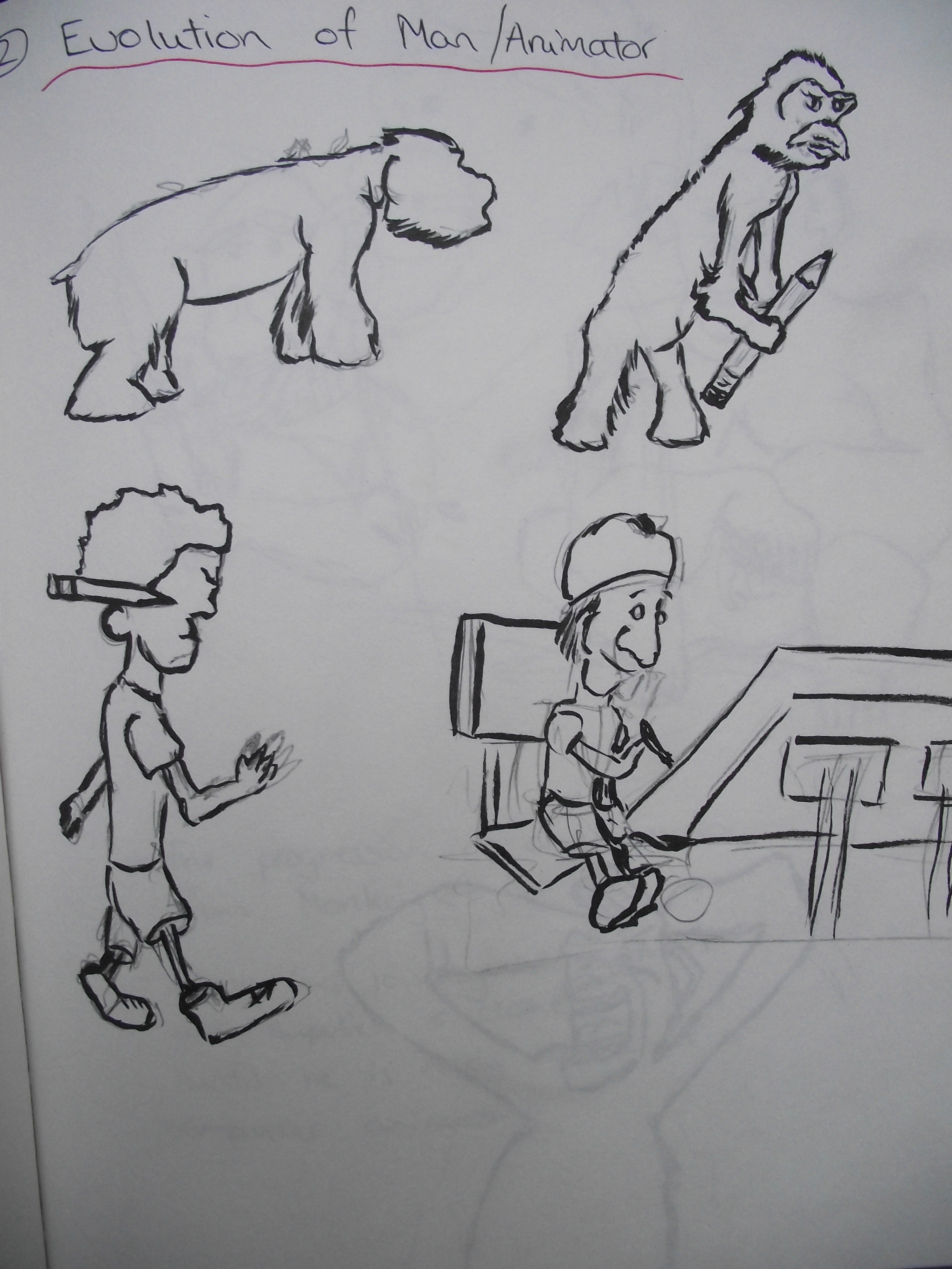 Another twist on an iconic image. This concept immediately struck the group, each of us having multiple ideas to add to the idea. We decided to twist the evolution of man in to the evolution of an animator. This early change would start of as an ape walking. The next stage would have the ape standing slightly taller whilst holding a pencil. Then a man with a pencil. The final stage would show a man at a computer animating.
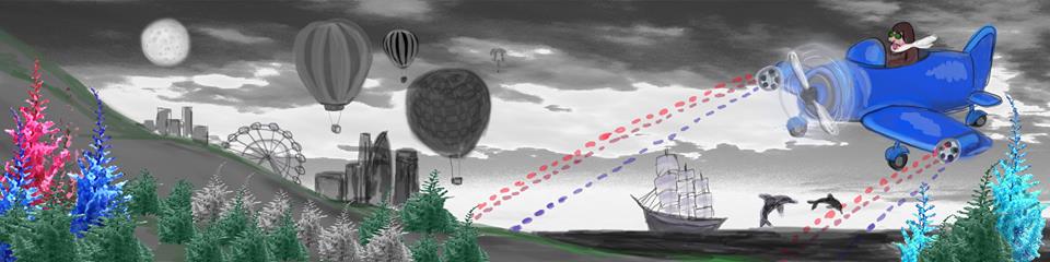
“Inspiration Plane Pilot”
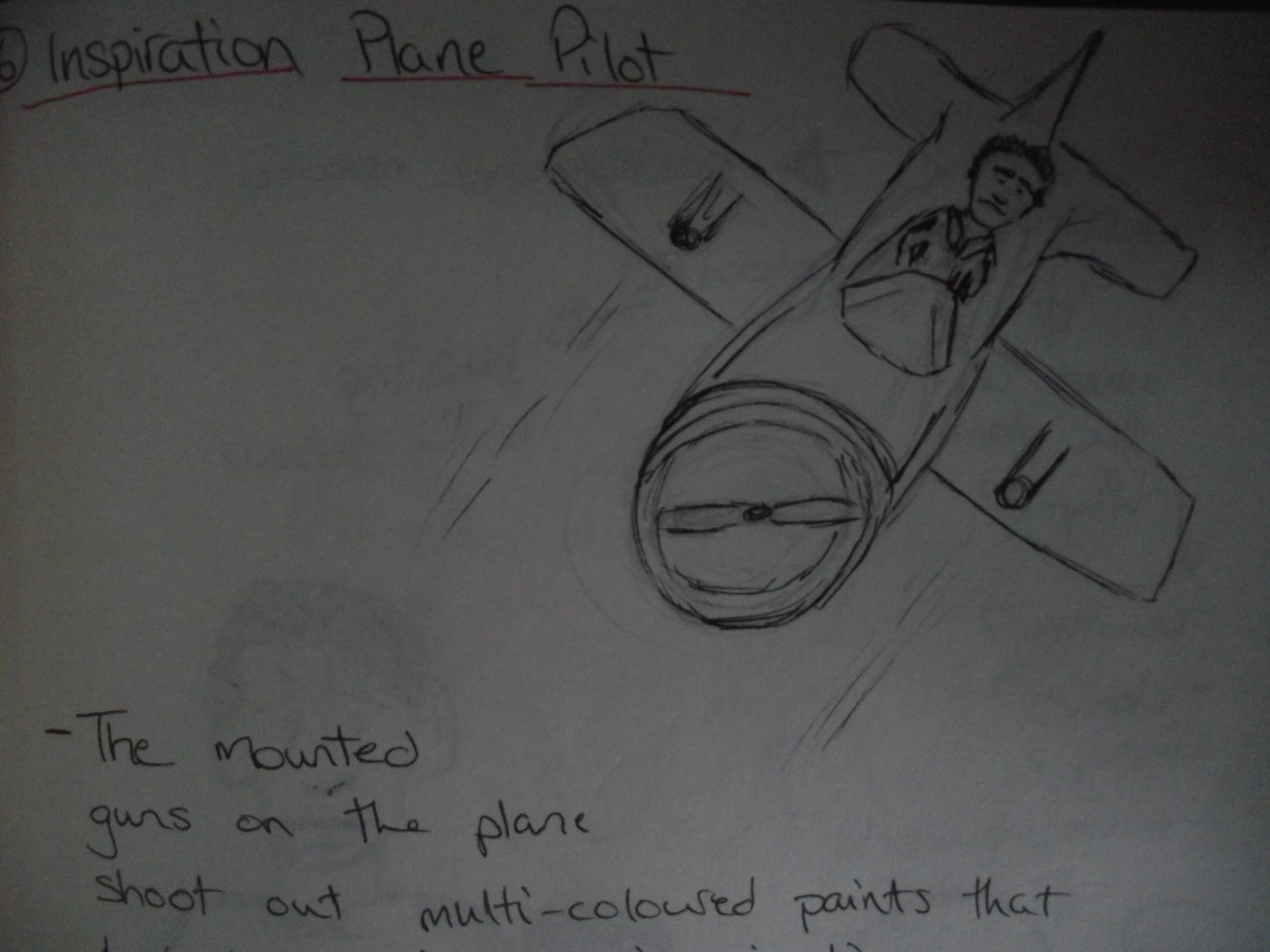
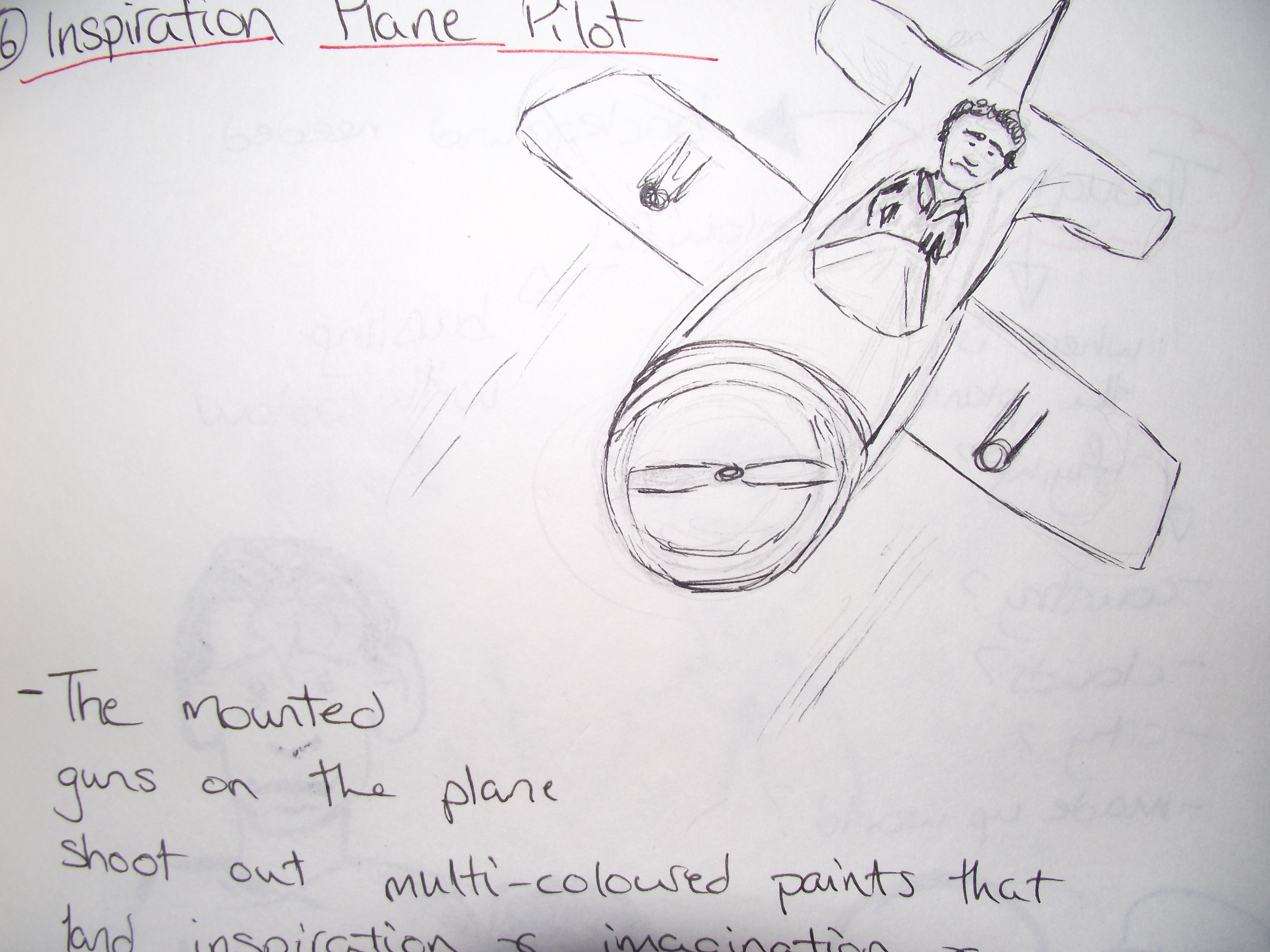
My interpretation of the idea
 This idea was very interesting and had a lot of potential for creativity, strong digital art and great layout and character design. The idea consists of a pilot that flies through the world and shoot multi coloured paint at people. This acts as inspiration and imagination when it lands on people. Julie used Photoshop and created two graphics with two different background details.
“The Animate Road”
 This idea for major project consisted of our two tutors walking down the yellow brick road on the road to the animation studios. A think this is another funny twist in a popular, iconic scene in movie history. It was yet another strange concept that our team had given birth to. However, this idea was short lived. I had drawn a plan in my sketchbook and thought that it as worth a mention as part of the journey of the project because it was a funny and simplistic idea which helped lead to the theme of a journey in our concepts for both creative enterprise and major project.
“The Creative Brain”
 This was idea for creative enterprise was interesting but was too simplistic and was not strong enough to expand upon. It was showing how the brain is divided into six creative pieces. The layout itself I thought was strong enough for a poster but as a whole it could not stand alone.
Whilst in this process we contemplated whether or not some ideas would be suitable in the form of a poster. We were asking eachother, “Would this fit as a graphic?”, “How could we lay out this image?”. This narrowed our ideas down. Once we had a number of possible ideas, we found it hard to choose our favourites, so we asked the assistance of the rest of the tables to help us vote.
Major Project
Together we took turns pitching our favourite ideas/concepts to the rest of our year group.
Uncle Sam Propaganda Spoof ;
Once pitched to the rest of the class this idea immediately became a favourite. It received a lot of positive feedback and gathered a lot votes.
5 votes
Art Wars ;
Again, once pitched to the group, there was a huge amount of positive comments and criticism. We were thankful of this as this was one of our favourite ideas. I think that the most appealing part of this design was the fact we used our tutors Mike and Conann as the main characters. It made the design personal to our group but still appealing to those who would not know that the characters are based on the tutors.
5 votes
Inspiration Plane Pilot ;
This concept was strong but unfortunately did not receive many votes and was left on the cutting room floor, even though some people did show substantial interest towards it.

3 votes
The Animator’s Bakery
As this concept was born at the very beginning of our process it only felt right to include it in the vote. It still generated strong interest amongst our group but the rest of the class showed little to no fascination with it. I think this is because we had not fleshed the idea out as much as we should have.
2 votes
So in the end of the votes for Major Project, “The Uncle Sam Propaganda Spoof” and “Art Wars” were tied with five votes each. We asked everyone to vote again and in the end “Art wars” took the lead and showed that it was the overall best design to work with which I was extremely pleased with. This gave us a definitive direction to go in with our Major Project design, and once this was accepted, the ball was rolling once again.
Creative Enterprise
For this we took the remaining strong ideas from our sketchbooks and asked the year group to vote. We found in this voting process that our ideas for both Major Project and Creative Enterprise could have been used for either poster/graphic. This made it easier to accept whatever concept was chosen.
Evolution Of The Animator ;
As this was one of the favourites, if not, the favourite idea for creative enterprise, we gave all our energy and pitching abilities into it. The pitches became easier for me atleast, because when we were reading from required reading I had discovered a book “The Art of the Pitch” by Peter Coughter. This gave us some useful tips on how to present myself and how to push to the forefront and deliver the best points of a concept.
5 votes
Cogs ;
This idea was continuing with the theme of a journey and what makes an animator. The cogs represent the pieces that make together an animator. However I think that people struggled to find a reason to vote for it as there was not enough detail given that could give them a visual of how to expand on it.
1 vote
The Animate Road ;
This design did bring forward a lot of positive feedback and the year group thought that it could have been a very humourous image. However, when put against the Evolution of the Animator, it fell slightly behind. This wasn’t such a loss as we had only briefly expanded on it ourselves. It had only become a minor focus for us in Creative Enterprise.
3 votes
So after pitching all of our ideas to our year, we came to discover that “Art Wars” best represented Major Project, and “The Evolution of the Animator” best showed off the theme of Creative Enterprise. Both of these concepts were personal favourites and we all had many more plans for expansion on each of the posters/graphics.
Stage 3
Final Concepts
We decided to split the work load evenly between the group.
Major Project ;
Nadine, Blain and myself under took Major Project. Nadine and I worked on the backstory and storyboard of “Art Wars” and Blain worked on the poster and graphic. We all as a group felt that Blain’s drawing style best represented the spirit and tone of what we were aiming towards. I meanwhile drew up plans for a storyboard and Nadine expanded on this by adding more detail and colour.
We (Nadine and I), told Blain about our storyboards and told him to just work with what we had. We explained that it had to be bursting with energy, colour and surrealism.
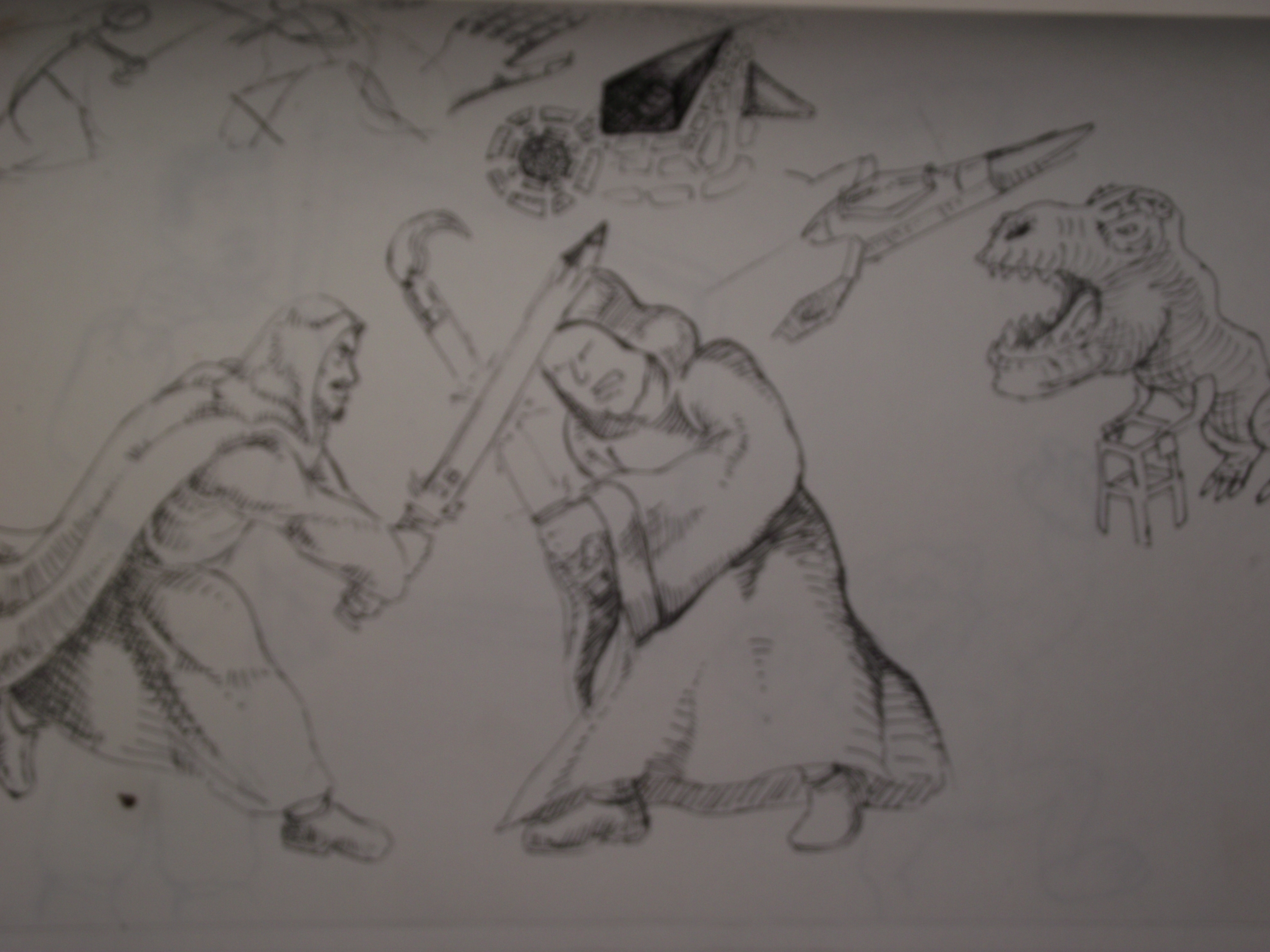
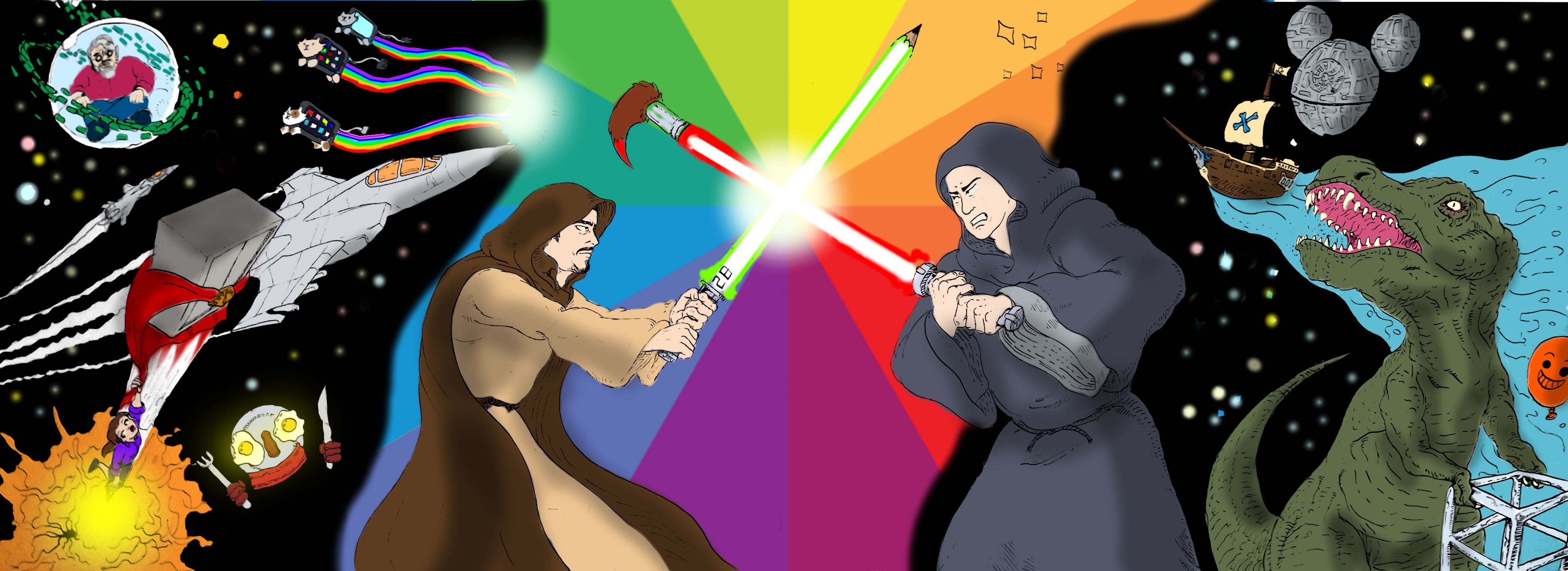
This is what he sent to us ;

This was exactly what we had in mind. It was exploding with creativity. We had took inspiration from everything that we had brainstormed about in our early work in week one.
We then incorporated our idea of the 2B pencil and paintbrush as different forms of a lightsaber. Also we included a psychotic idea that we thought of as a joke in the early days of the project of a dinosaur on a zimmer frame. This has no relevance to Star Wars or our own twist of Art Wars, however it still works in a strange way. It seems to have a purpose in the poster, as it is part of the story. It fits and never appears to be out of place
After reviewing this early sketch, we could not wait to see the next stage of the poster.
This what became the final poster/graphic. By adding colour through the use of the GIMP software, this image was given a new surge of life. Notice the idea of the twist on the Death Star, it is now the Mickey Mouse Logo. This is where in the storyboards, Conann and Mike battle over their differing opinions Limited Animation. Also you can see iPhones with cat faces on them flying across the page leaving behind a a streak of multi-coloured light behind them.
Overall, I think that the poster and graphic give this concept a whole different point of view than what we had originally planned. The surreal aspect compliments the design and everything in the background focusses towards the centre of the image where the battle is taking place.
In my opinion it was better than anything that I had originally planned of during the ideas and concept creation.
Creative Enterprise
Scott and Julie started work on the “Evolution of the Animator” in which they were working on the graphic and poster. They came up with a number of different designs for the ape characters, which I also took note of in my own sketch book ;
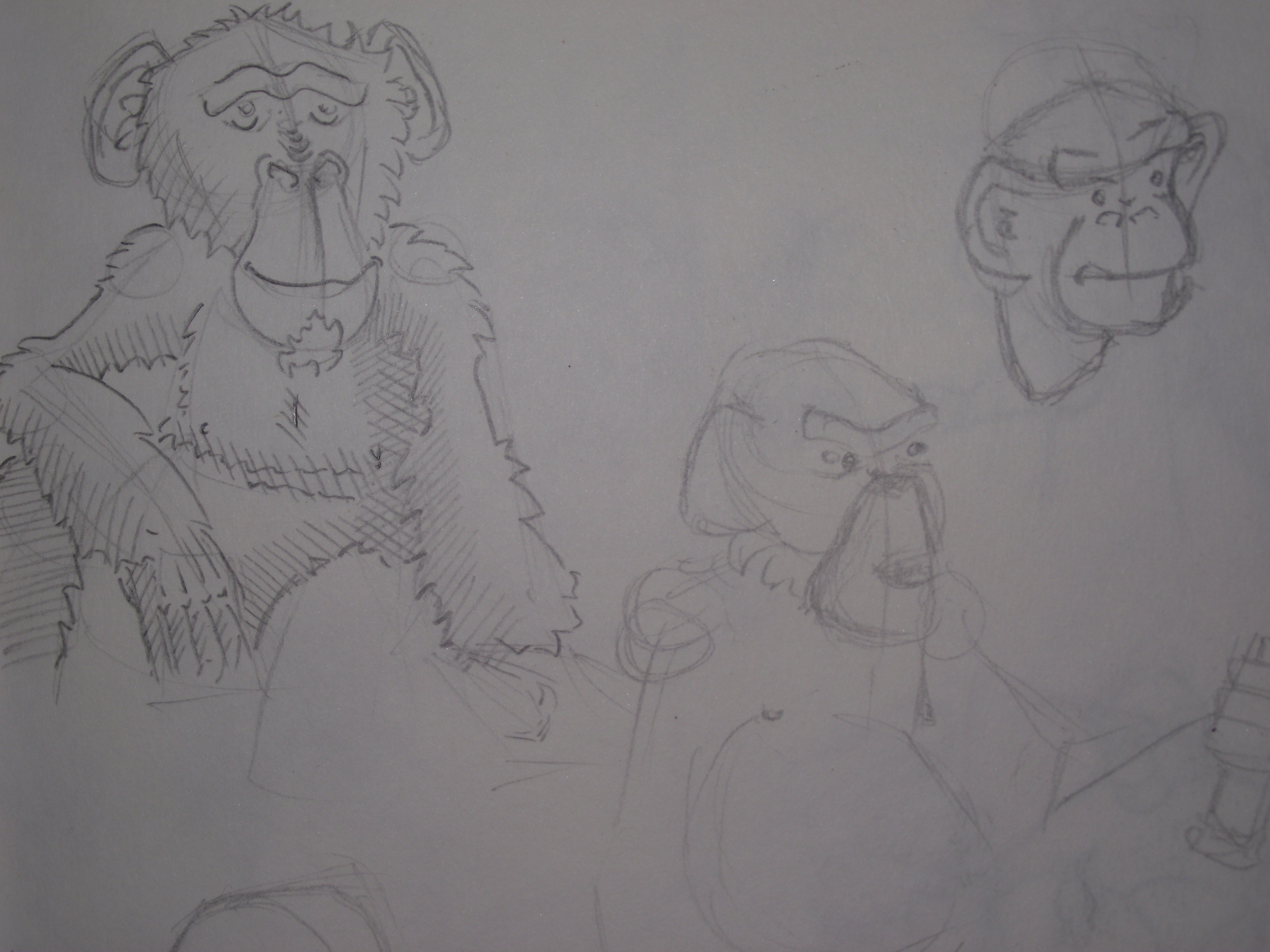
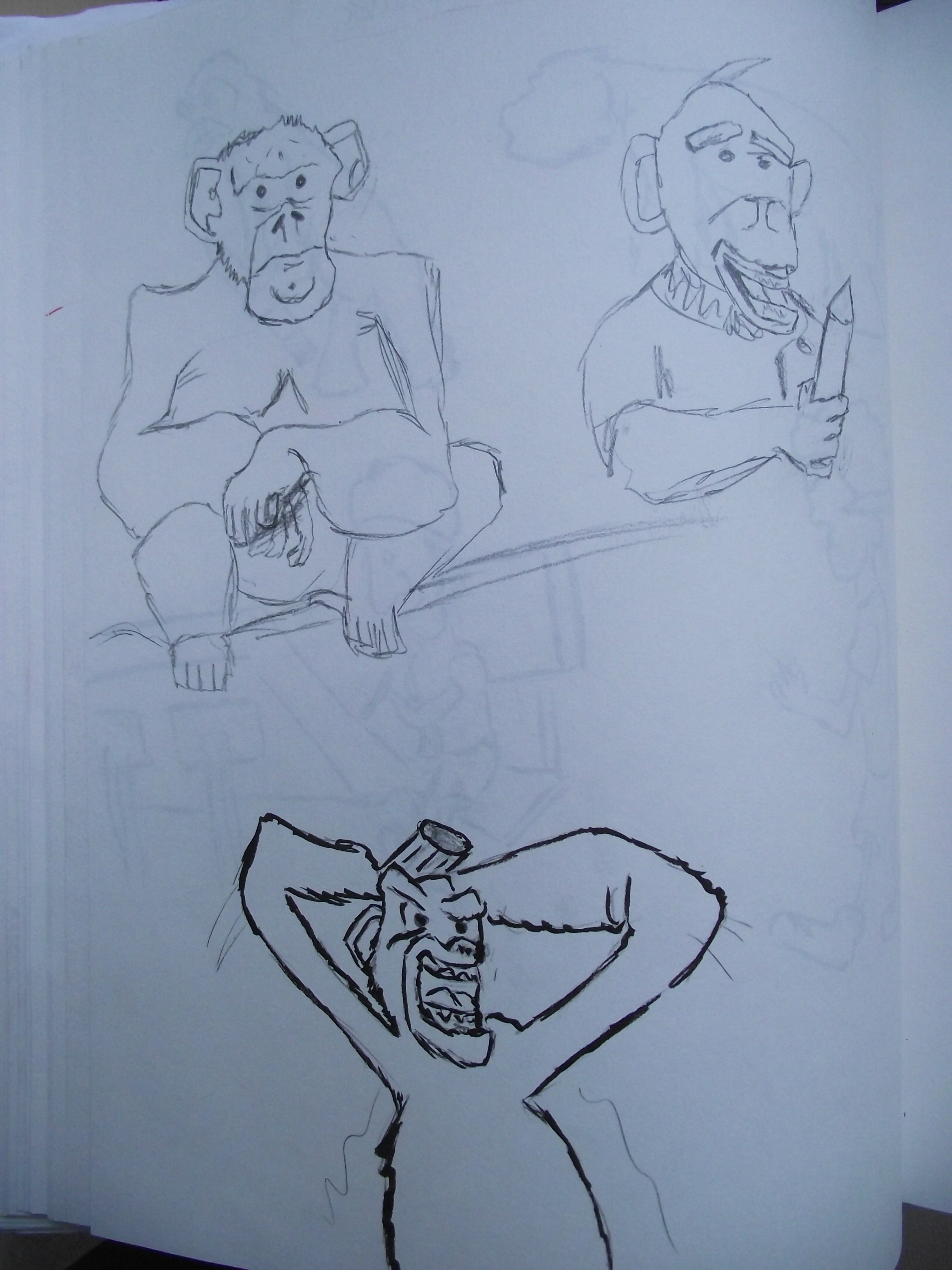


We all talked and negotiated what would be included in each stage of the progression. We thought that by giving each monkey/ape an expression that illustrates each stage would be more practical concept.
I believe that they did a great job in the character creation and also in the poster in which they made it look like a comic strip, illustrating the Evolution of the Animator in a very compelling story.
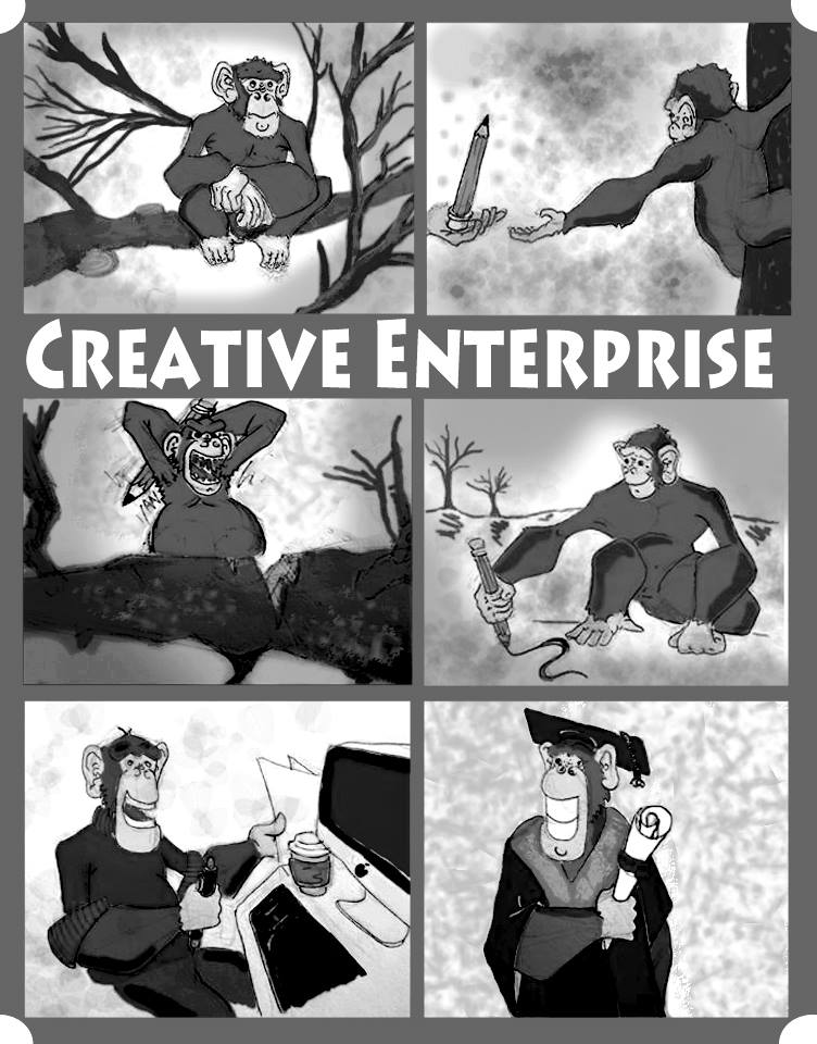
 The final poster design for the evolution of an animator. We all agreed on the layout and content in each image. We as a group found that this put the message across and was easy to follow and understand the story and message behind it. All the character expressions clearly illustrate their frustrations, joyfulness and contentment,
 This was an original plan for the graphic which was part of the stepping stones of thought that brought us to our final graphic image. This shows two monkeys imagining their future as animators and their future with art. It is humourous and easy to follow but we found that our original plan of the iconic image of evolution spoof would flow better and connect more effectively as a graphic.
 FINAL GRAPHIC OF EVOLUTION OF AN ANIMATOR
We decided that we would put the characters in a silhouette style. This adds a simplistic feel and yet still retains the quality of the original designs in my opinion.
Prezi
I worked on the Prezi and gathered images of everyone’s concepts from their sketchbooks, also including my own. I found it a simplistic and easy to use. The Prezi is simply just made up of a couple of notes but mostly it is filled with concept designs and sketches of our early plans and ideas. We found that having a lot of notes in the Prezi would make people lose concentration and become bored of our presentation. If we filled it with interesting designs we believe that the rest of our year group will be fully invested.
Conclusion
As a whole I am extremely proud of what we have created in this module so far. We have made so many ideas and concepts throughout this whole process and as a group we have grown stronger in our team based work and the division of the work load between us. The final outcome of both posters are exceptional pieces of work. The journey to get to that point also has been a great experience and has helped to maintain my belief that team based work in this degree is the most efficient way to work.
Feedback
After our presentation on Monday 7th of October, we were given feedback on our posters/graphics. The main ideas were given great compliments from Conann, however he felt that we relied too heavily on the personal side to it, meaning that having his and Mike’s faces as the two main characters in “Art Wars”, made us closed minded and in that sense we lost out on the potential for more great ideas.
Also in “Art Wars” our poster . . . was not a poster. It was placed in a landscape fashion whereas a poster should be in a portrait style.
We began to look back over our research and retrace our steps. We realised that the original star wars posters work effectively because they are built up of images that are forged together into a triangular shape.
 This is something that we had completely overlooked. Reflecting on this we realised that we had discovered a huge flaw and decided to use these original works as our inspiration for our own “Art Wars” piece.

So we took the same images in the “Art Wars” piece and focused them in a proper, more appealing and professionally presented poster. By doing this I think that the poster has been given a new life, a new birth. By doing this simplistic change the poster has a focused point of interest. Everything in the background and the contents that surround the central image, face into the middle of the design. This acts a focal point and naturally our eyes look into the middle and see the main image properly.
Also for our Creative Enterprise poster “The Evolution of the Animator”, we realised that we had to reorganise a few images. The first of these being that the poster’s different blend of colours had to be rearranged as they did not fuse together as well as we had originally thought. So to fix this problem we decided that the border around the poster had to be made bigger, this made the writing more defined instead of being squished into the top corner.
 EVOLUTION OF AN ANIMATOR POSTER CHANGES
By putting the title in the middle it makes everything more organised and the presentation is more efficient.
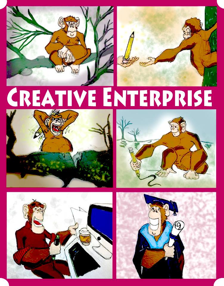
Below are the changes for the graphics for evolution of an animator. They have a kind of charm and simplicity that I really enjoy. I really like the use of colour. It gives a professional quality to the design.
 A first design of the graphic. We felt that the colours were too dramatic and didn’t have the correct blend of colour fusion we were looking for.
Using this entirely different graphic design we have came up with a more professional and appealing graphic. By simply changing the colour of the characters shirt we have the perfect blend and transition from the background to the foreground. They separate from eachother perfectly and it makes all the difference in the final design.
Final Concepts
Major Project
The final “Art Wars” Poster Design
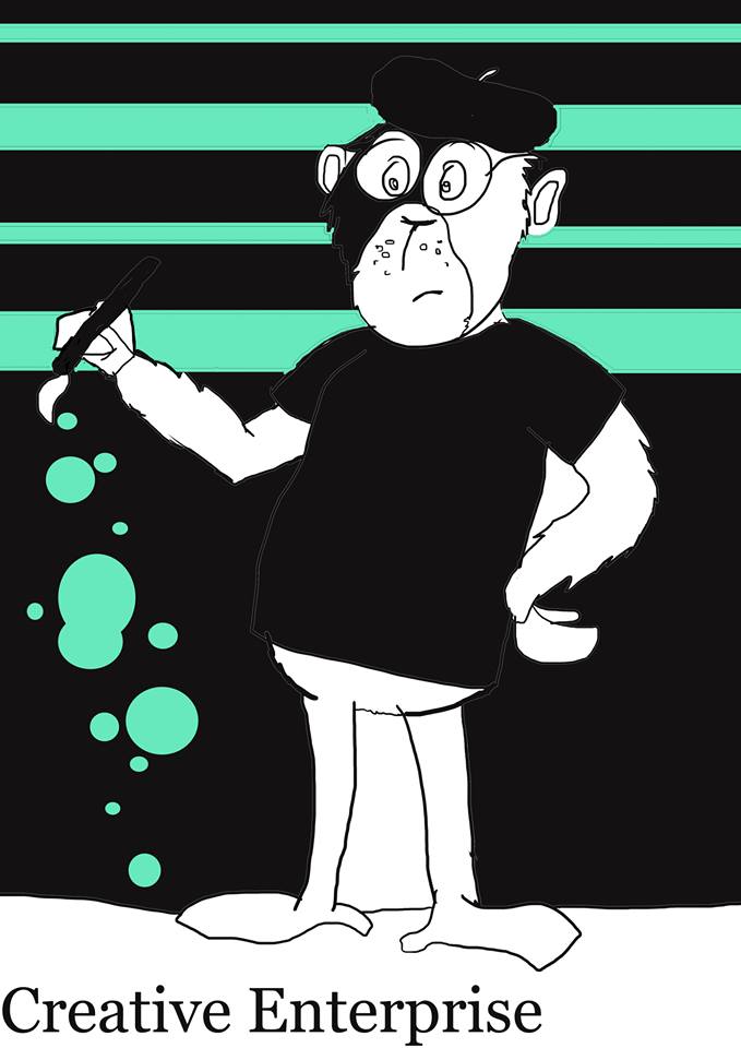
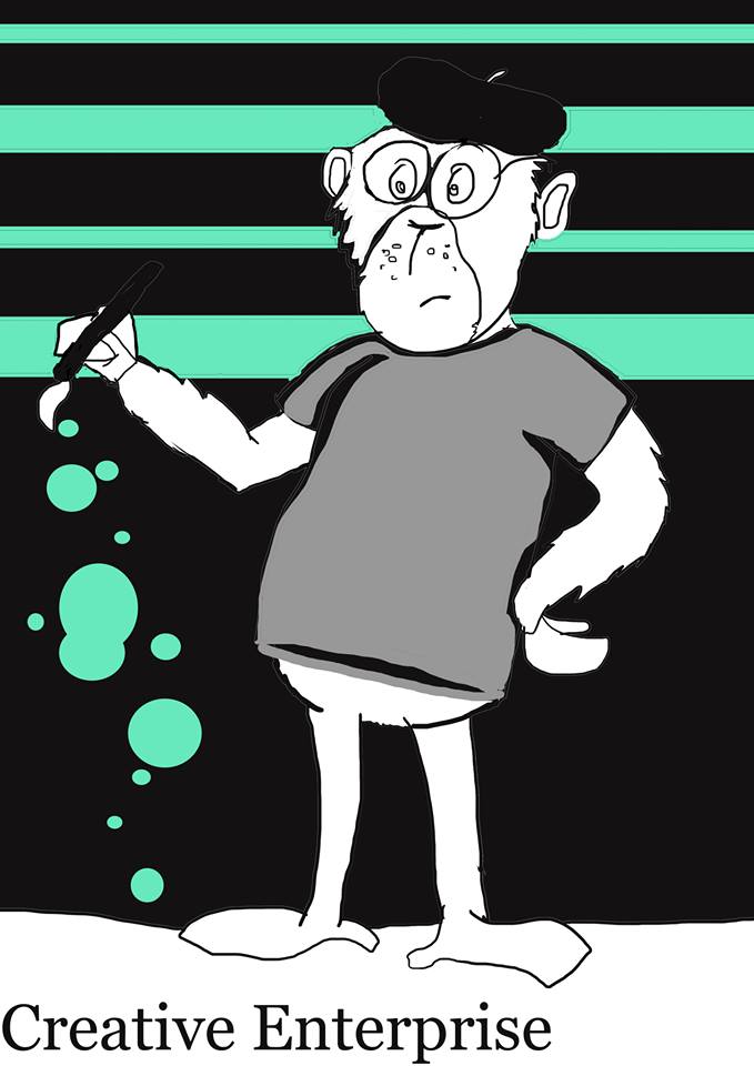
The final “Art Wars” Graphic
Creative Enterprise
The final Creative Enterprise Poster
The final Creative Enterprise Graphic

Recent Comments